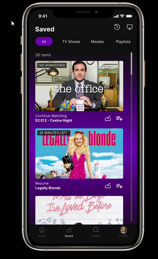
My Role
As one of only two designers working across four project teams, I was responsible for a significant portion of the design work. I led the design efforts, collaborating closely with product owners, product managers, and developers. I not only executed design changes but also provided vital strategic input, argued for best practices, and ensured consistency in the design system being used. I also contributed to the company's design library, making the design system more robust by adding new components, thereby allowing future designers to work more efficiently.
I then created design solutions that not only adhered to Salesforce Lightning Design Standards but also incorporated Humana's internal UI standards, ensuring a cohesive and consistent user experience to meet both user and business needs. I also actively participated in discussions with product owners and product managers, advocating for best practices in UX design and providing constructive feedback on proposed changes. It is important to note that although very little user testing was feasible in this phase (the team was more focused on migration rather than feature enhancement at the time) I leveraged my expertise in UX Design principles and considered user needs and constraints in every decision made. Throughout the process, I worked closely with product owners and product managers using wireframes and prototypes to iterate on design solutions and gathered feedback from stakeholders to refine the designs further.
Screens Visualized
To illustrate my work I have included screenshots of screens below that showcase the design changes I made, with annotated explanations highlighting improvements made to user flow and navigation of the CRM Service Platform.
For this design task, I was required to prototype the user flow of how a Humana Internal Agent would go about adding a new form of payment for a plan member. In order to create this prototype that effectively communicated the s process the Humana Agent would go through I had to work closely with my product owners to understand the user flow and then leverage my ability in Figma to prototype the flow.
Procedure Code Search
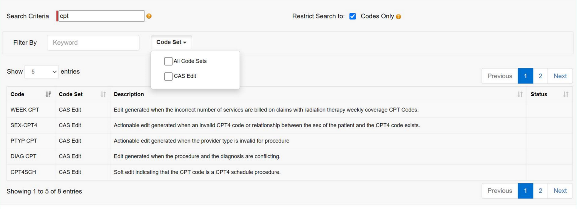
Procedure Code Search Screen (in Classic CRM Service)
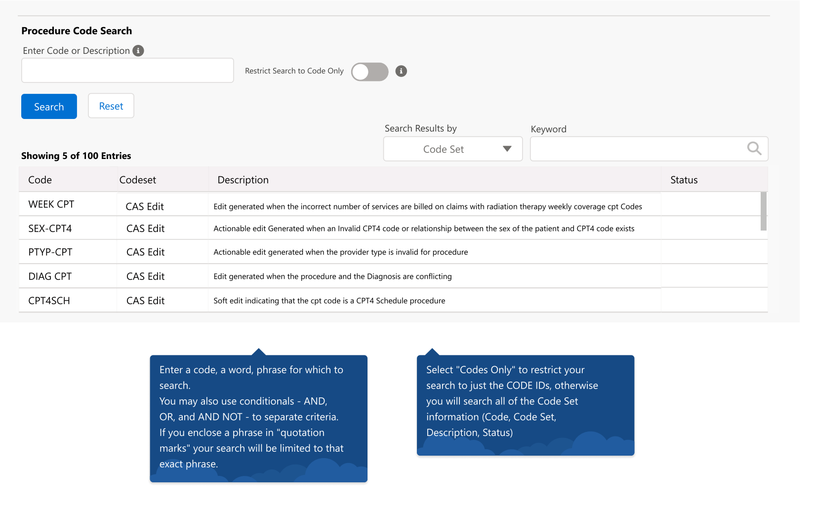
Procedure Code Search Screen as seen in the Lightning version of the CRM Platform
Making sure that the procedure code screen is up to UI SD Lightning standards. Created a completely novel screen to use in the Lightning CRM Service that improves upon the old procedure screen design by optimizing the users ability to use any required filters and search through and find the necessary items through a procedure code search. The old classic UI Procedure search (which can be seen in the first image) failed to take into account the users accessibility and navigability. The procedure code screen designed by me here allows the user far more affordability and for this reason is the current design in use in the CRM Service.
Interaction Panel
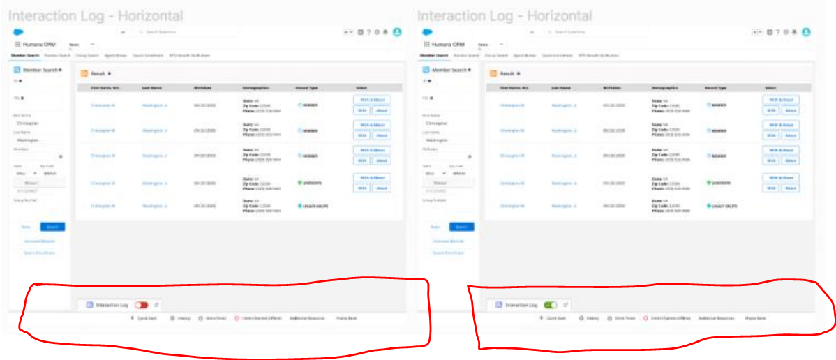
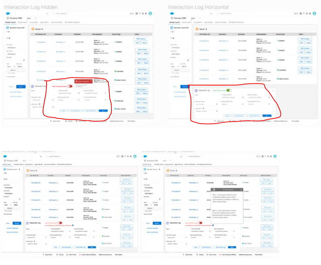
Creating this particular screen was an interesting task because it required visualizing an entirely new feature that simply did not exist in the classic version of the CRM Service Platform. A panel was required to be created such that Humana agents can manage and log interactions with callers while on the call with them. Specifications for this design ask were that the panel should not be blocking out important details on the rest of the screen and additionally should be easily accessible from a visual stand point when minimized and still allow the user to communicate certain important information. In order to gain a deeper understanding of the design specifications I ran through the user flow an agent would go through with my P.O’s in the event of a call and then design the panels accordingly. I produced several different designs that took into account the specifications highlighted to me while still optimizing the real estate being used on the screen. After presenting the screens of the panel designs to my Product Owners they decided to have the lower set of designs developed for the current version of the platform as it optimized space without blocking out important information on the screen thereby offering an elegant solution to the problem.
The highlighted section shows the screens I created
For this feature, the design ask required a Process History Panel to be created wherein the user can see all of the procedure changes being made to a specific members policy. The design required that a clear process timeline be visualized for the user to see all of the changes and for an alert icon to be created that would effectively communicate that there is an alert that needs to be addressed by the user. After speaking with the stakeholders to understand what the design problem was I was able to visualize a panel in the screen that clearly displayed a timeline of chronological changes and in addition to this I created several different alert types in order to see which would be most effective for the user and grab their attention.
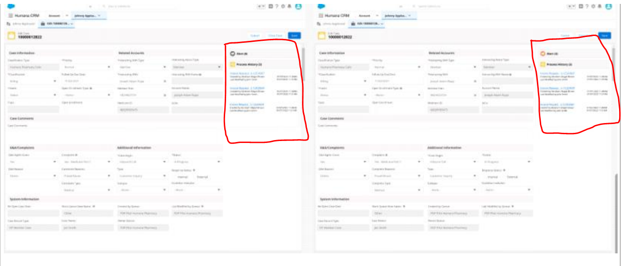
For this design ask a way for the Humana Agent to be able to pay for their members billing items within a table containing their billing information had to be created. Users had to be able to click on the button in question which would then trigger a popup from which they could then pay for the billing items. Initially business had deemed it appropriate to use radio buttons to trigger this. I, however advocated for a more user-centered solution that made far more sense for a better and more comprehensive user experience which was to use some kind of button. As a result this is what I proposed to the pertinent stakeholders. However I needed to consult the Humana UI Standards as well as the Salesforce Standards before presenting this to all the relevant parties. Upon further study I arrived at using a linked Text within the table that met both the Humana and Salesforces standards which business was happy to accept. In this way I was able to ensure I was remaining consistent with both Humana and Salesforce Lightning Design Standards while enhancing the user experience.
Results
The design changes implemented in the CRM Service Platform have had a significant impact on the usability and efficiency of the application. The improved user flow and navigation made it easier for internal Humana agents to navigate the internal application and ultimately provide better customer service. The changes have also contributed to a more robust design system for future designers working on the platform, guaranteeing consistency. My efforts in arguing for best practices and organizing design files were well-received by stakeholders and contributions in enhancing the overall UX maturity within the company were also significant. The iterative design approach, wireframes, and prototypes used in the process helped in visually showcasing the design changes made, ensuring scalability of the platform.
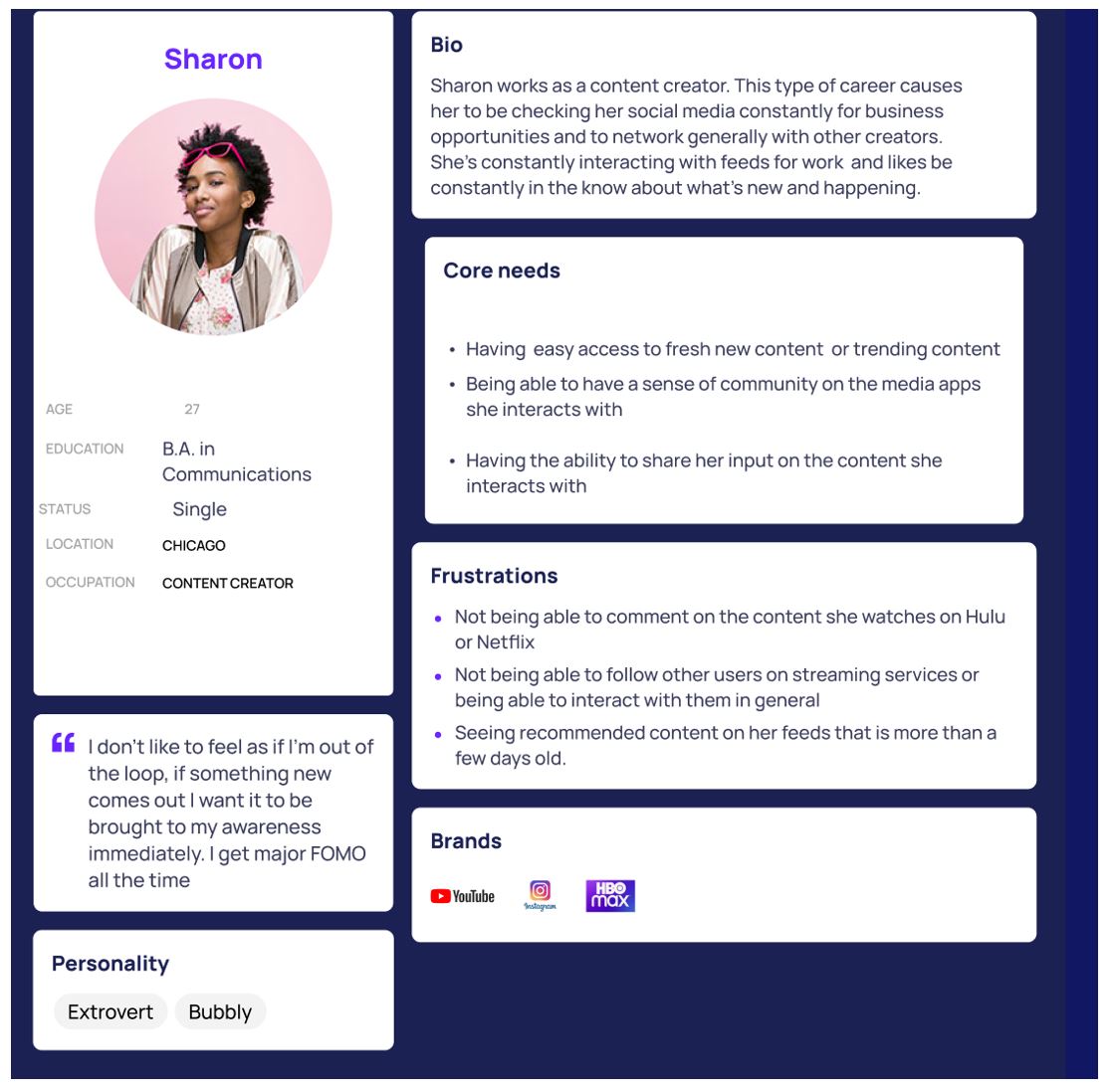
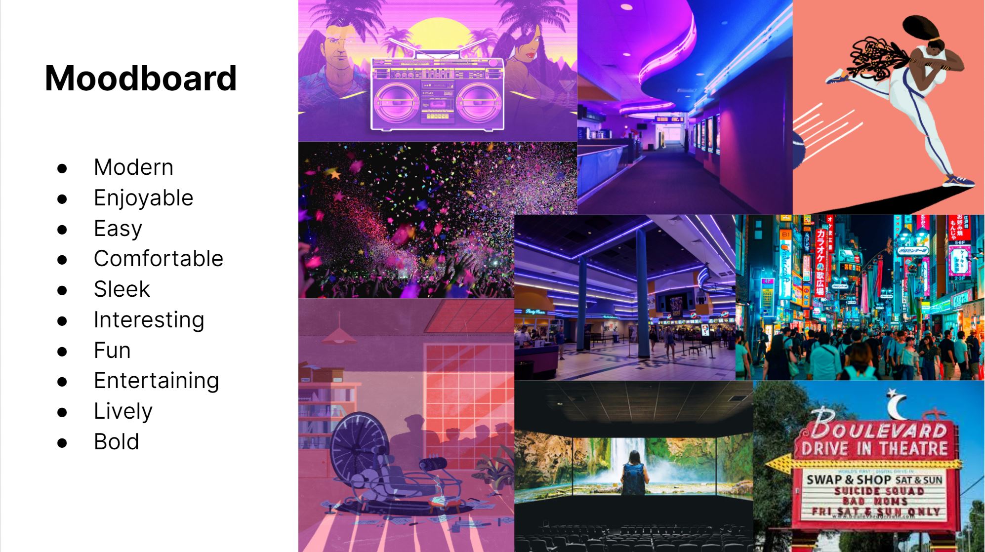
The Design Problem
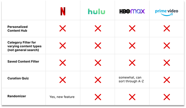
29-36 year olds are very active users of media streaming apps (ex: Spotify, Netflix, Hulu, etc.). However, their work-schedules limit the time they can spend searching for new content. Our teams goal was to improve how content is found and filtered to help these users reach an informed decision quicker, providing them with more time to relax and unwind. Though there are more than plenty of movie and video streaming apps available on the market such as YouTube and Spotify. Most of the apps are lacking in some way or the other in that they do not provide an intuitive way of curating and personalizing the viewing experience of their users.
User Insights: Online Research
The team and I first set about doing some research online, into popular streaming apps in order to gain a basic understanding of the problems that users are facing when using streaming apps. We started by looking into forums and websites that showed us important user information and pain points. From our online research we found that :
- Millennials are more likely than older age groups to have watched a video online in the previous 24 hours and visit social media sites several times a day.
- Study highlights that Millennials prefer new tech because it helps them use time more effectively
- Spotify Usage Data shows that 29% users are males 25-34, and that over half of the users are male.
This information demonstrates to us that these users are habitual and very active
User Insights: User Stories
Reddit Forum
A major pain point for millennials is that they are presented with inaccurate recommendations on their feeds that are not relevant to the content that they engage with
Spofity Forum
A major pain point for millennials is that they are presented with inaccurate recommendations on their feeds that are not relevant to the content that they engage with
Hulu Community Forums
-Users express issues with being able to navigate the Hulu UI (not being able to locate the content that they want to watch)
User Insights: User Stories
- Millennials are more likely than older age groups to have watched a video online in the previous 24 hours and visit social media sites several times a day.
- Study highlights that Millennials prefer new tech because it helps them use time more effectively
- Spotify Usage Data shows that 29% users are males 25-34, and that over half of the users are male.
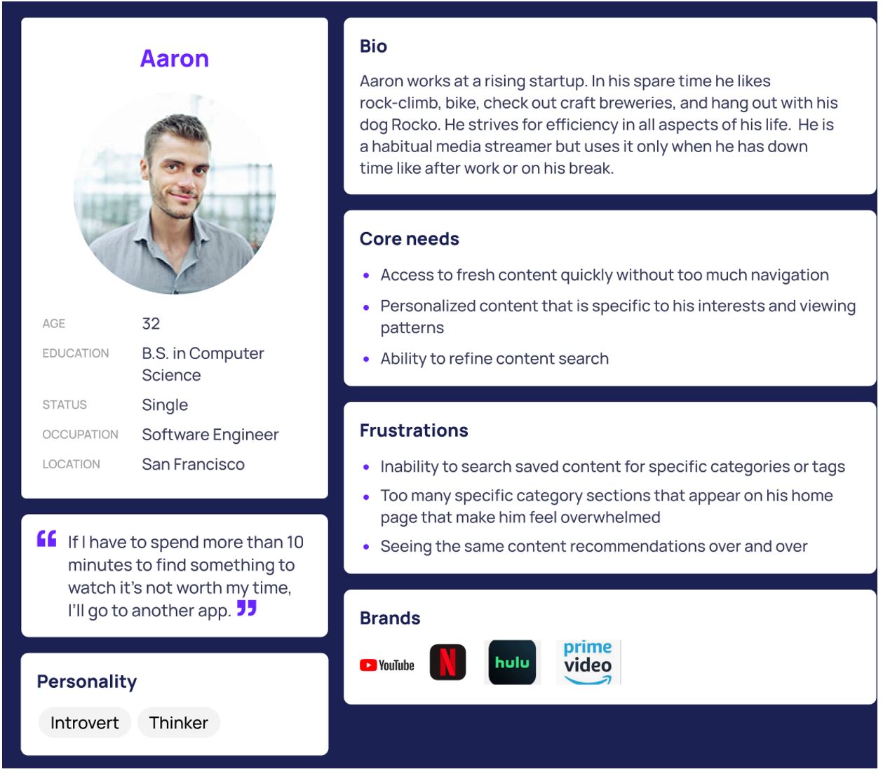
At this point our team began to create two unique user personas that most appropriately captured , the target market as well as the issues that they are encountering with streaming apps.
User Stories Personas
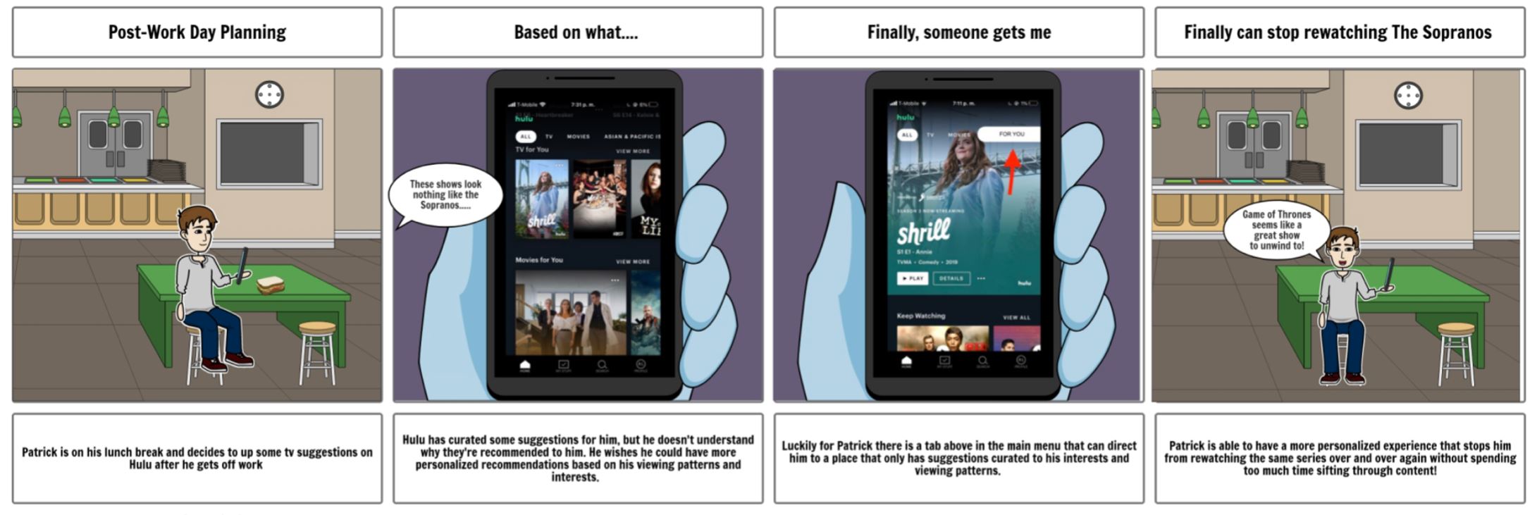
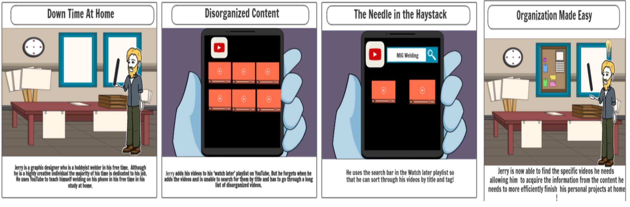
Storyboarding - User Journeys
Storyboard Insights
Storyboard #1
Storyboard #2
Insights
Summary
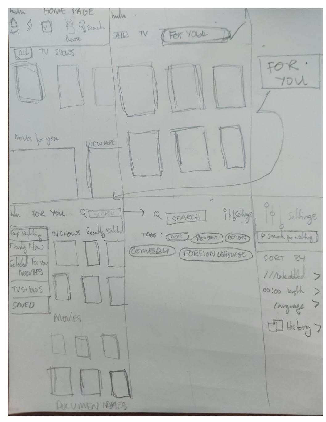
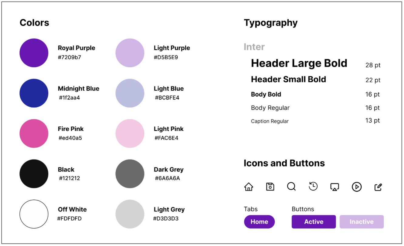
Developing the High Fidelity Prototype
The Final High Fidelity Prototype
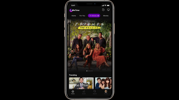
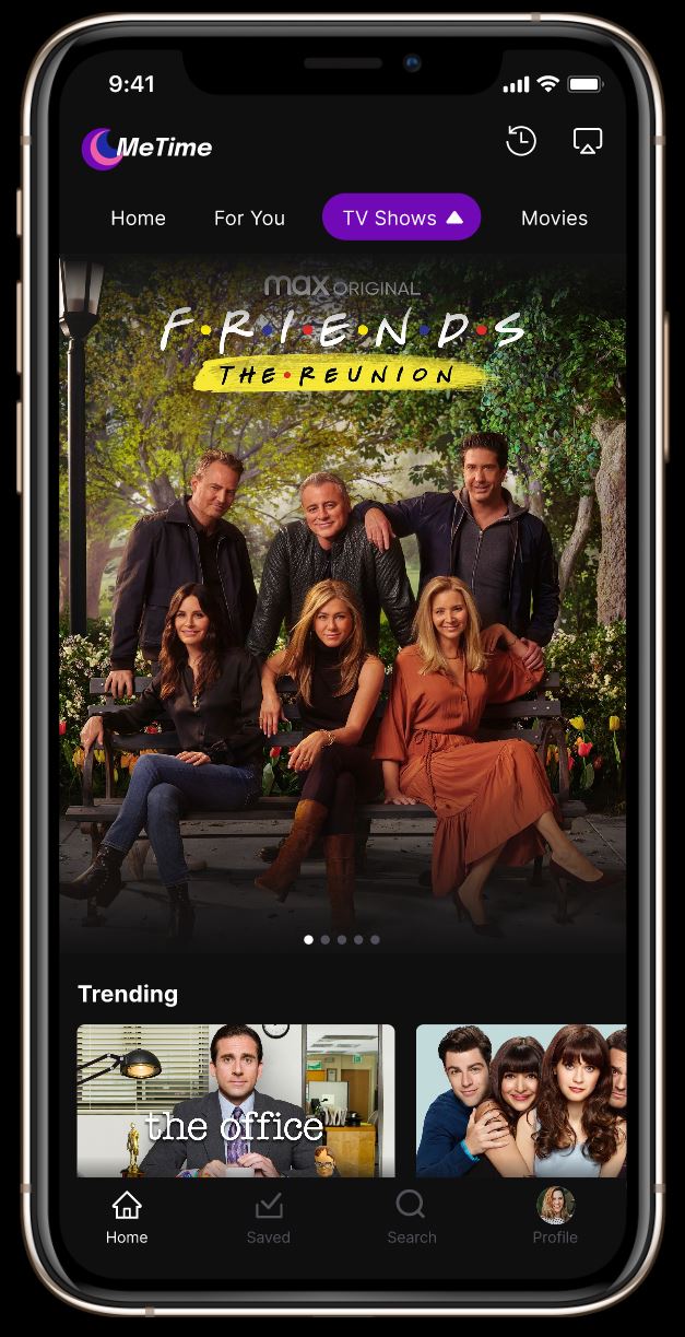
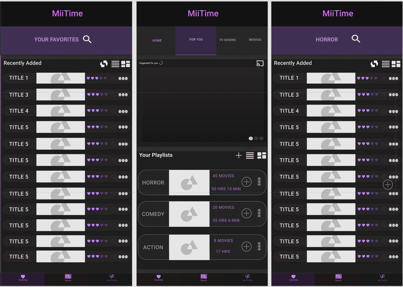
The Home Page
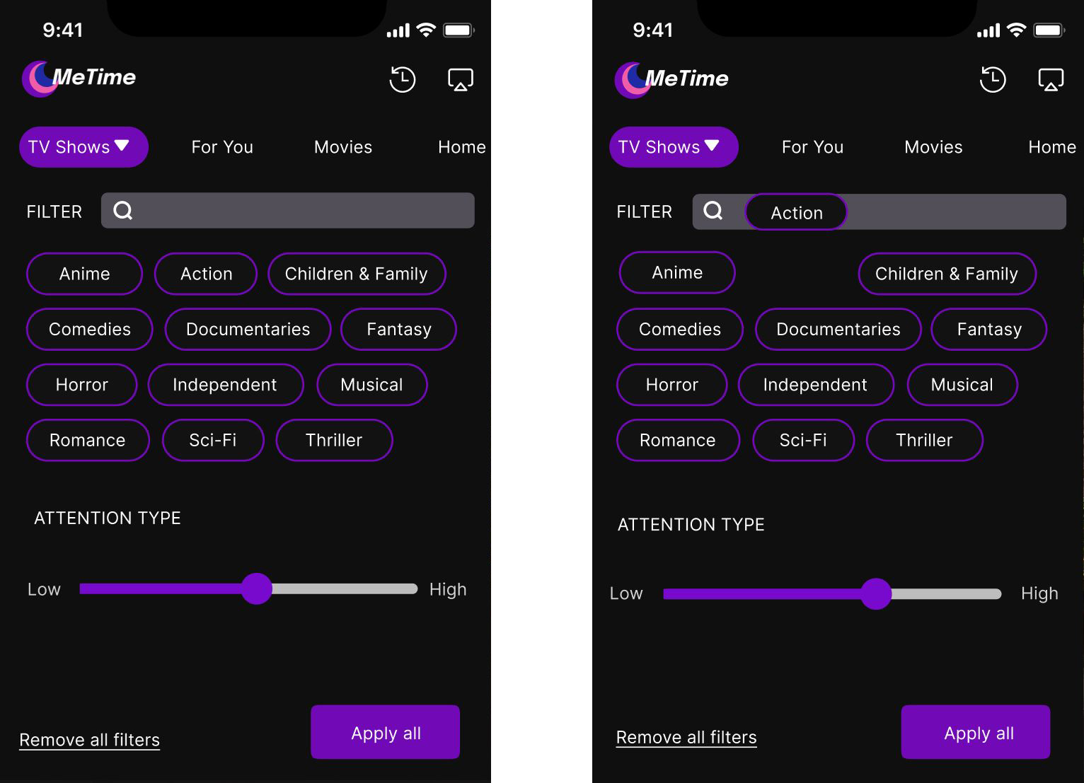
Searching by Tags
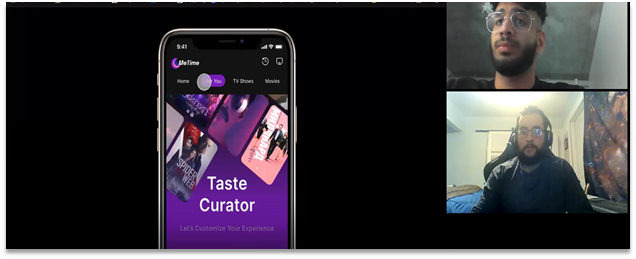
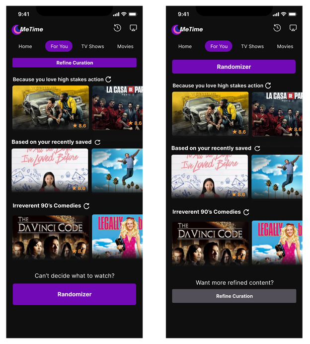
Taste Curation
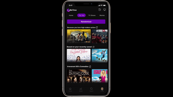
Randomizer
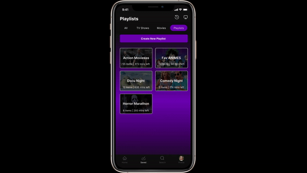
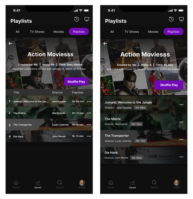
Playlist Creation
The Playlist Creation Feauture allows users to refine their selection in their saved content list. Gives the option to save content into playlists so users can further personalize their viewing experience and have content saved in advance for specific occasions
Saved Content Filter
This feature allows users to be able to search within their saved content (TV shows, etc.) by tagging the genre they are searching for.
Usability Testing and User Comments
Feature #1
Feature #2
Feature #3
Improvements Made
Based off our user testing there were a couple insights about our playlist feature and randomizer button that led our team to make a few size and location changes. For our playlist feature we decompressed the overall look and increased the font size to help users locate it as well as resizing & relocating our randomizer button to the top of the ‘For You tab’ for clearer accessibility.
Further Improvements to Consider
These are some potential additional features that we would include:

Autoplay option
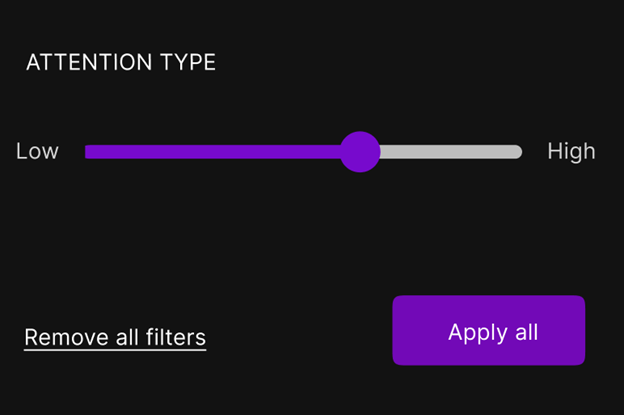
More advanced filter options, like an attention gauge, content, and length
These are some potential additional features that we would include:
A nugget of insight that we gleaned from one of our teams interviews was the fact that many users oftentimes use their streaming apps just as background noise for when their energy is directed towards a task that requires a high cognitive load. As a result of how commonly this was said among the users, our team believed that one of the filters that should be included for both saved content (content specifically saved for the user) as well as within their own curated playlists was an attention gauge. Increasing the attention gauge will yield results specifically from genre that has been tagged. For example, if the user wants to view something where they can afford to pay attention , they can interact with the meter, dragging it towards the right. Searching with this tag will then result in action movies that require a high amount of attention.
Real Life Applications
Around the same time we were developing our interface for MeTime, Spotify released an update that allowed for users to search through their playlists by mood. Essentially allowing their users to tag whatever genre they are feeling and add it to their ‘Find in playlist’ search bar. This would then yield results for that specific genre from the playlist they are searching through . This is very similar to our ‘search by tag’ filters for our ‘Saved Content’ tab, which allows our users to search through their curated content by genre. More on this feature can be found here: https://newsroom.spotify.com/2021-02-25/how-to-sort-your-favorite-songs-with-spotifys-new-genre-and-mood-filters/
The Design Problem
For this project I worked on creating a new homepage for UCSD’s HAO LAB. The lab integrates biology, engineering and computer science, in their studies. The Lab is doing riveting work in cutting-edge exciting fields such as anti-aging, stressing and narrowing down the pathology of diseases. For a lab that is doing such novel work, it only follows that their homepage should reflect this. In this light, the Principal Investigator of the lab and his development team reached out to me, requesting me to help redefine the overall look of the website and as a result elevate the branding of the LAB as well as help inform visitors to the website.
Homepage
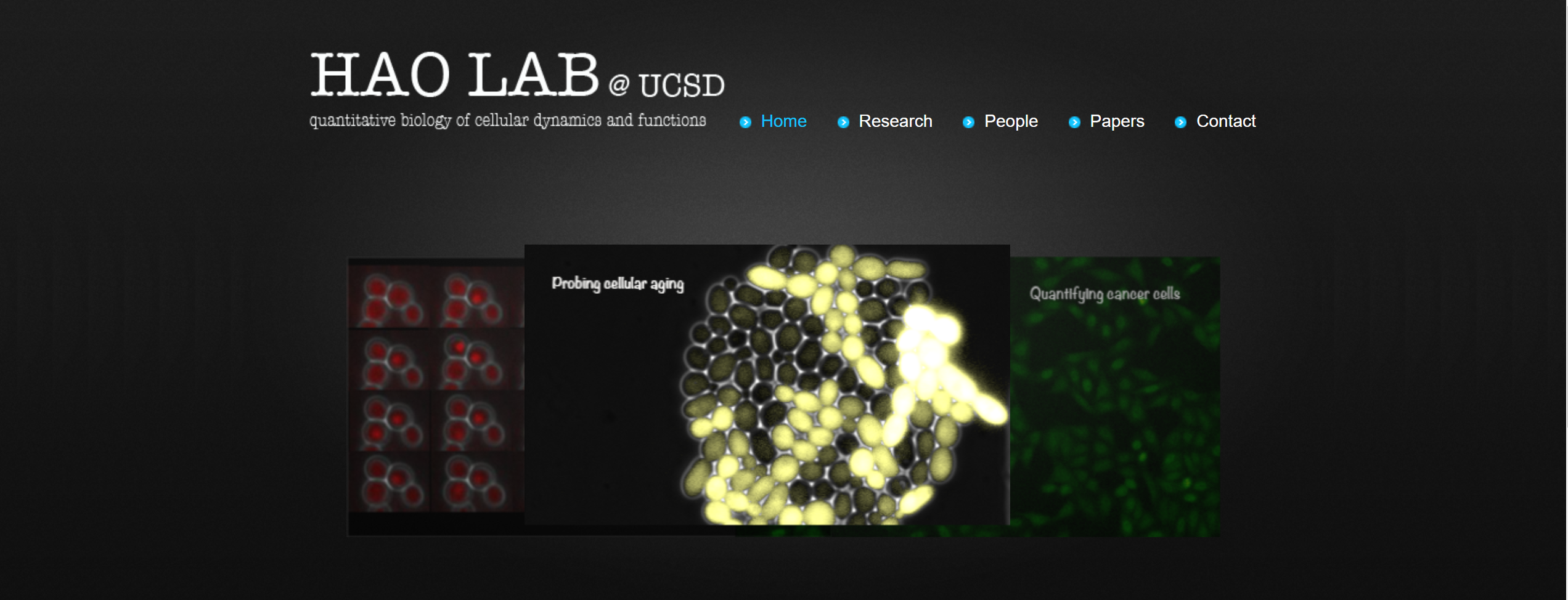
Devoid of much life and character as it stands
The P.I Nan Hao, communicated to me that he wanted the landing page to truly capture the futuristic nature of the work being done at the lab. As a result in my conversation with the client he requested that I create a 3-D interactive environment that would look visually appealing and at the same time engage the visitors of the web page in such a way that would compel them to explore the work being done by the lab. With this in mind I began to ideate and come up with different environments which captures the essence of what it feels like to be in a LAB environment and leaves the visitor with an almost child-like feeling of awe and wonder making them want to explore the rest of the work that is being done in the lab, on the website.
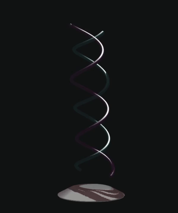
DNA Helix Strands
My first idea was to experiment with the DNA Helix strands and to create a 3D animation that would capture the attention of the visitors of the web page. For the purpose of the seamless integration into a website, I chose to use an online 3-D software called Spline.
After having created the strands I then took this model of the DNA Helix Strands to my client in order to get some feedback about the design.The P.I Nan Hao had some insightful feedback about the Helix Strands. The feedback has been summarized in the notes below:
'I like the way that the light that goes along the DNA strands. I don’t particularly like the colors of the Helix and I would like the helix to be more clearly illuminated. I would like the rotation of the animation to be looped, and not mirrored. It would be nice if the strands had an almost holographic glow effect so that they stood out more.'
Improved Helix Design and Animation:
After having taken the feedback from my client into consideration, I then began to iterate upon this DNA Strand. I started off by changing the textures of the helix strands so that they appeared to be more luminous and glowing so that an ethereal effect was achieved. I also changed the animation so that the strands did a continuous 360 rotation rather than a 180 which was then mirrored and reversed.
The final design can be seen below:
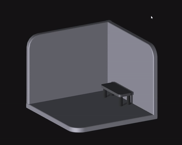
The Science LAB:
After having finalized the DNA strand design and animation, my client informed me that in addition to the Helix Strands he wanted there to be an interactive environment in the homepage that conveyed the feeling of being in a LAB. With this in mind I set about creating an open science lab which visitors of the web page could explore and feel as though they were truly looking and interacting at all of the different aspects of a science lab. I started off by iterating and creating the skeleton for the model of the science lab, modeling just the walls and floor of the lab.
Having created a base model, I then began to add different lighting as well as colors to make the room feel as though it was a science lab. I lightened and extended the size of the walls and added a work bench and floor tiling to give the room a more clean and clinical feeling:
HAO Lab 2nd Iteration
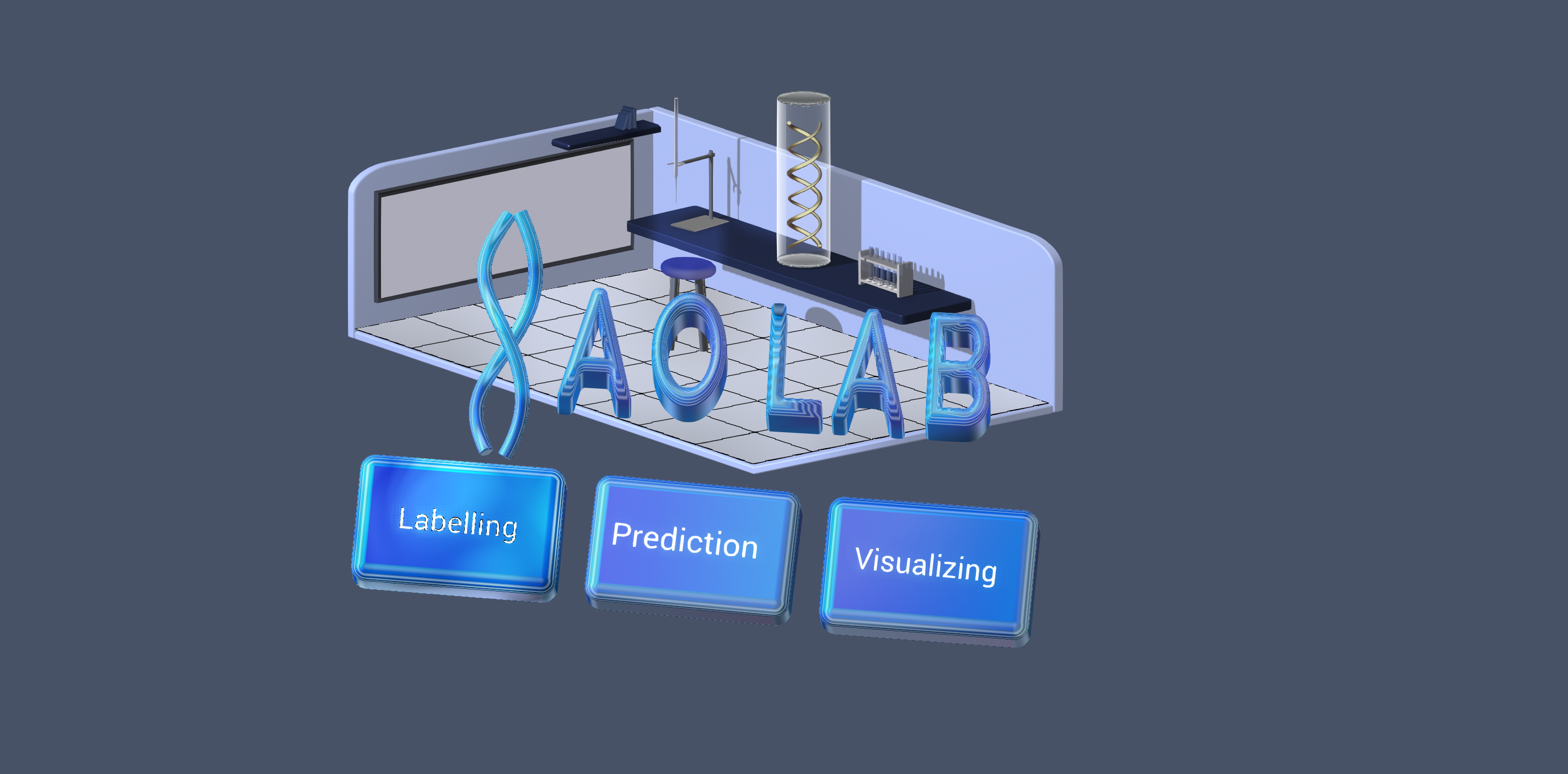
fter having a better idea of what the room should feel and look like, I began to add more specific objects to the room that are characteristic of a science lab. In order to create a an accurate model of a science lab , I visited the HAO Lab in order to gain a better understanding of how the lab should look and the necessary features of the lab that go into making it a science lab. For example, I decided to model and add test-tubes, a microscope, a whiteboard as well as books and a shelf. This can be seen here:
HAO Lab 3rd Iteration
After having finished the 2nd iteration I showed the design to the P.I. The P.I suggested design changes to help communicate to the user what they are seeing. The P.I suggested:
- The logo of the Lab (HAO LAB should be in a location that is more visible to the viewer. I want it to be the first that thing that the visitor on the website sees.
- There are no actual test tubes used in the lab.
- The user needs to be directed to three different pages from the home screen.
- The buttons need to be accessible and should directed the visitor aforementioned pages
Taking my client’s feedback gave into into account coupled with having to account for certain constraints of the software; I was forced to change certain models and objects that were too heavy and caused loading issues in the textures when the environment had to be embedded into the website. In place of the different pieces of equipment such as the sink, microscope and test tubes I instead created a model of a Burette and Burette Holder.
In order to keep the viewers attention I also incorporated the Helix and its animation into the scene to keep the viewers attention. I decided to place the HAO Lab Logo and the three buttons (which when clicked will direct the visitor of the website to the pertinent Webpage) together, directly in front of the camera so that the visitor would know exactly where they are and how they can access the web pages concerned with the different work that the lab is doing on their website.
The image of the 3-D environment can be seen below:
FINAL DESIGN
After finalizing the 3D interactive environment of the Lab with my client, I then embedded the 3D Environment onto their website using webflow. This is what the new homepage of the website looks like!. To view the website itself: https://haolab.webflow.io/


.png)
.gif)